Remember when you were a little kid and everyone asked you what your favorite color was, and you always had an answer? You didn’t need to think it over, or think about what anyone thought, you KNEW, in the depths of your being, that your favorite color was _____. I want to bring that certainty and sense of confidence to your brand. Although it is really important that you personally love your brand colors, it’s also important that they communicate to your audience, on a deep, non-verbal level, what your brand is about.
While color is very fun to think about and plan, it is also very subjective, and can be overwhelming. The question I usually start with is What 5 adjectives describe your brand? They can be words like warm, tough, inclusive, ambitious, etc.
From there start to think of colors that resonate with your adjectives. For example, a warm and inclusive brand may lend itself to warmer colors, such as yellows, oranges, burnt ochres, etc. For a tough brand it may make sense to use more black and white, reds, etc.
Another option is to refer to your brand mood board and pull colors from there. If your brand mood board is full of desert sunsets, rock formations, etc., then you brand color palette should probably include some of these warmer tones. You can eyedrop directly from the photos and adjust from there. Or an easy way to do this for non-designers is to use Canva’s color palette tool https://www.canva.com/colors/color-palette-generator/. So fun!
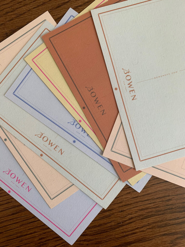
CULTURAL SIGNIFIERS:
It’s important to do a bit of research on how your audience will respond to certain colors. For example, in western/european communities we generally associate white with purity, weddings, etc, although historically this has not always been the case. In many eastern asian cultures, it is considered a mourning color because of the influence of buddhism and the concept of rebirth. In some tribal cultures, colors are grouped more broadly, for example sometimes blues and greens are all described with the same word.

DESIGN CONSIDERATIONS:
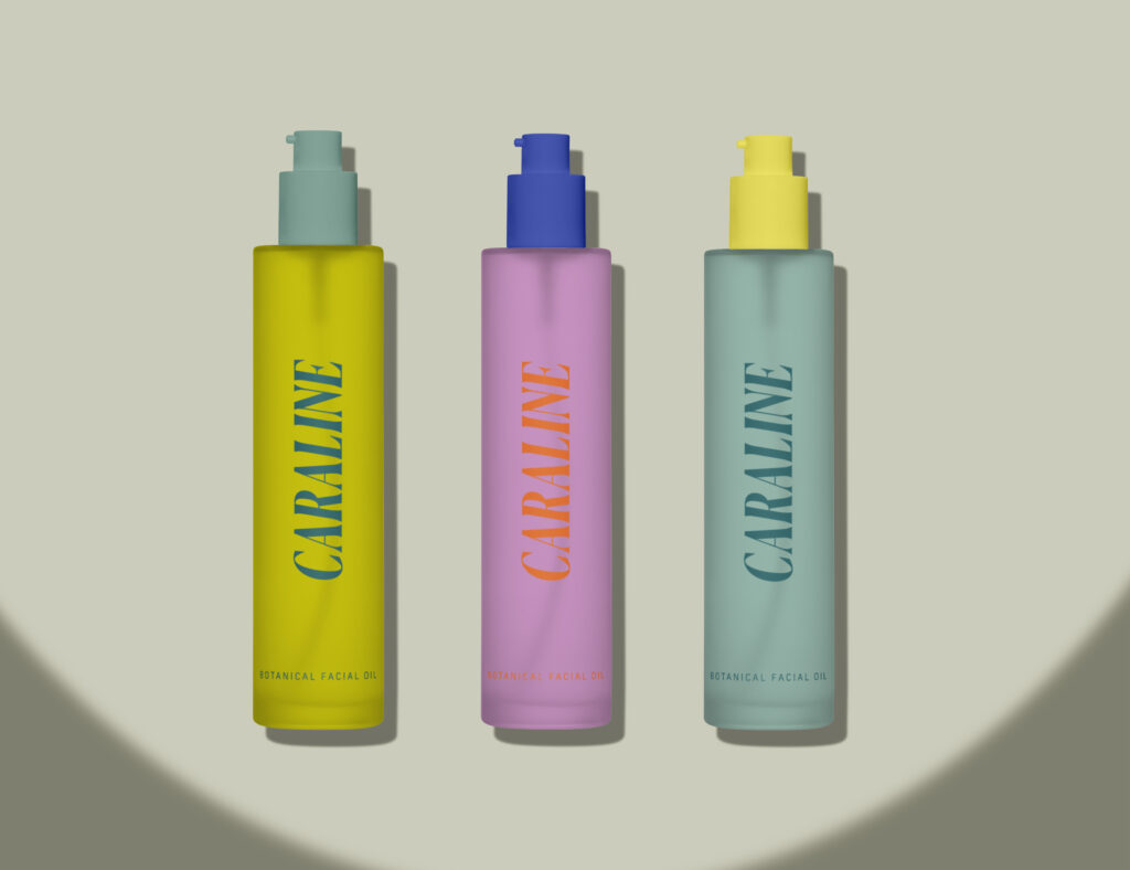
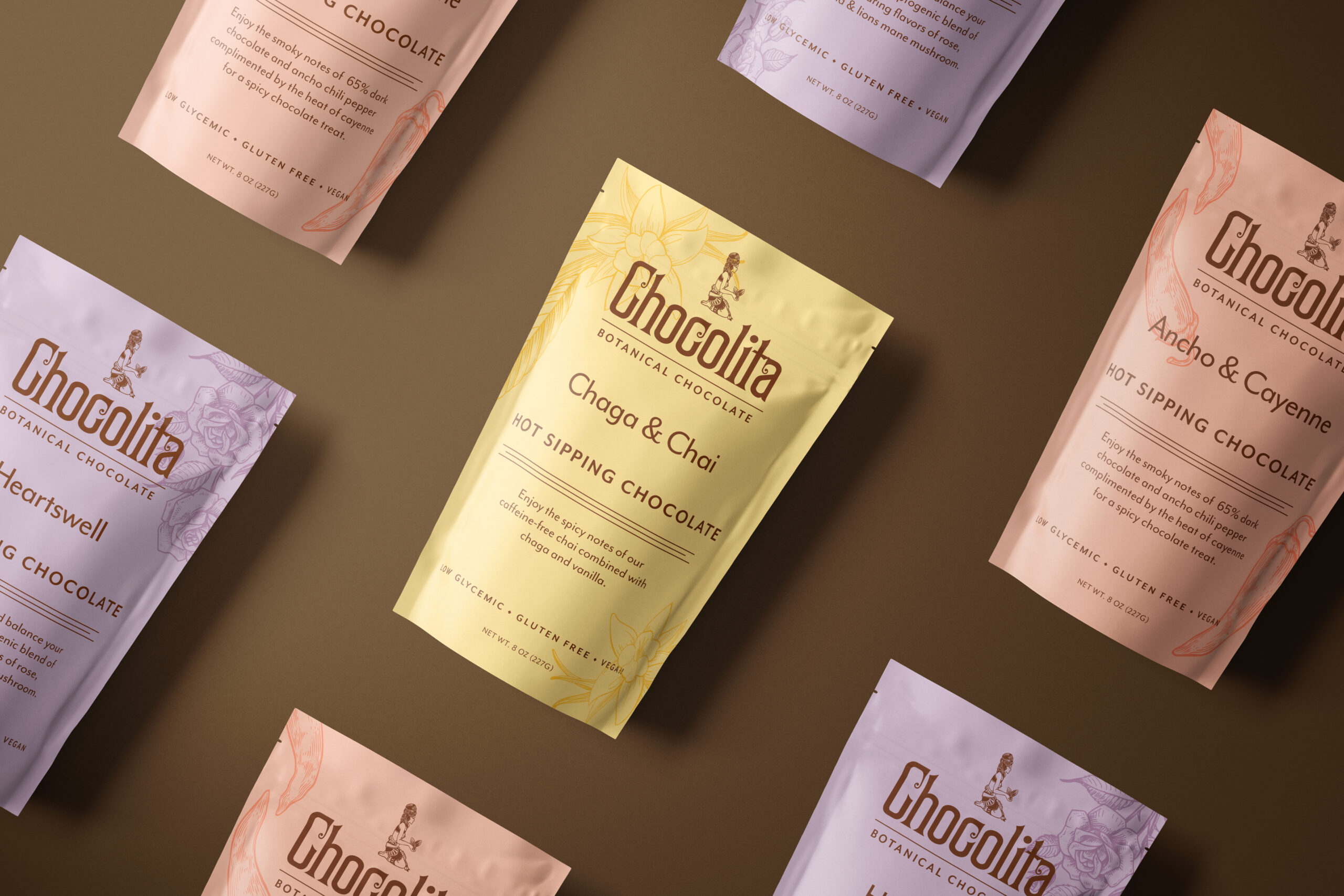
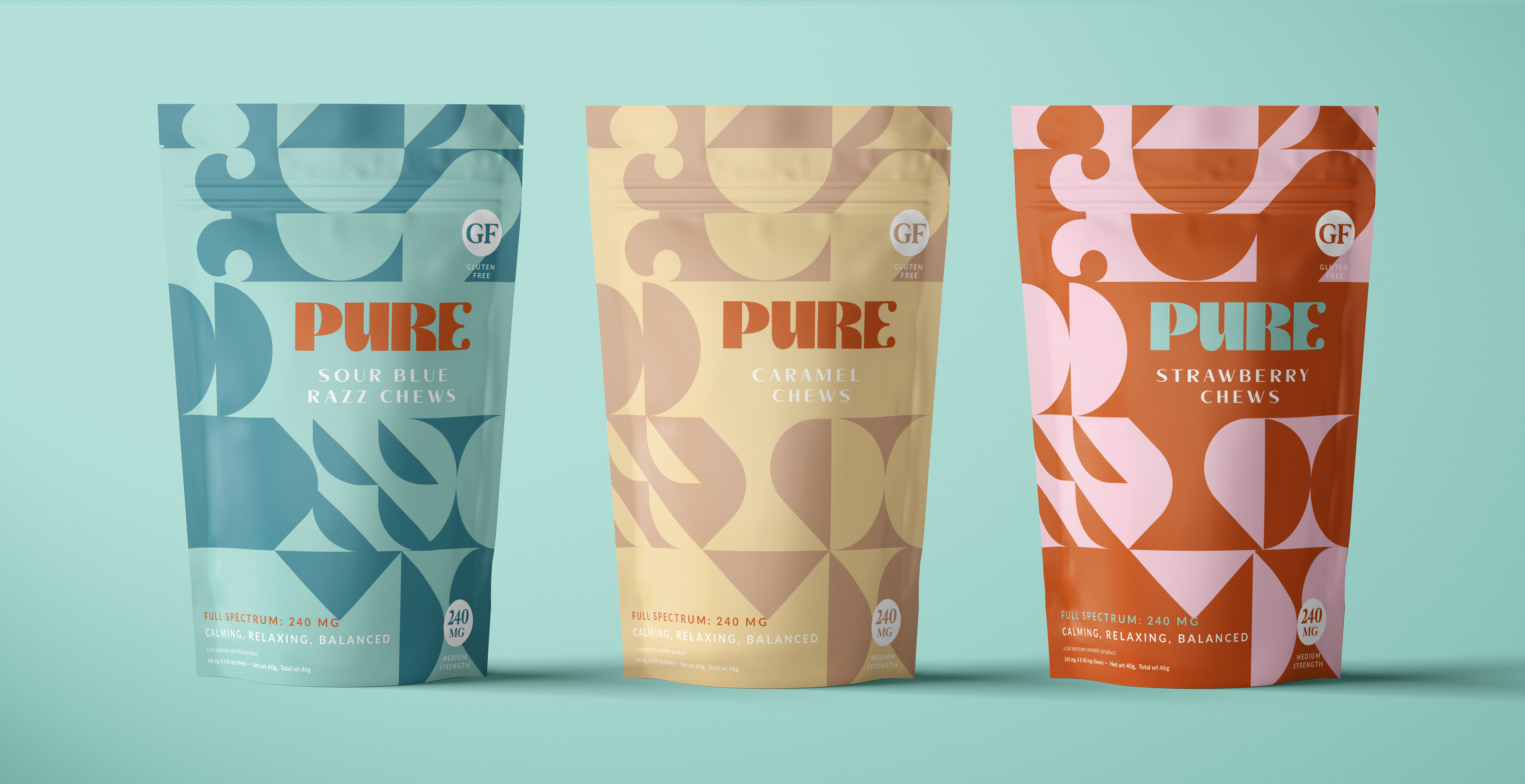
A few notes about color. Just because colors work from a brand and psychological perspective does not mean they will work from a design perspective. Just because you vibe with colors does not mean they will work in every context. It is important to balance the practical — will this yellow type show up on this pink background?, with the strategic — what will this communicate to my customers? Some things to keep in mind: it’s often helpful to have a range of tonal colors to work with, for example, a dark blue, a medium blue, and a light blue. While complementary colors (blue and orange, red and green, etc) can provide a lot of energy and contrast, they can be difficult to work with at times, for example orange type on a blue ground vibrates and can be very difficult to read. For accessibility reasons it is a good practice to test your color combos for contrast on screen to make sure they are accessible to various audiences. The Web AIM site is a great tool for this. You enter in the hex codes and it will tell you if that foreground color, background color and type size combo meets web accessibility standards.



Comments +