When making typography decisions, first determine which type of content you are presenting.
When looking through a typographic lens, there are two types of content:
THAT WHICH YOU MUST TO ENTICE PEOPLE TO READ, AND THAT WHICH THEY HAVE TO READ.
In case 1, you want to draw attention, create an emotional connection, make a statement.

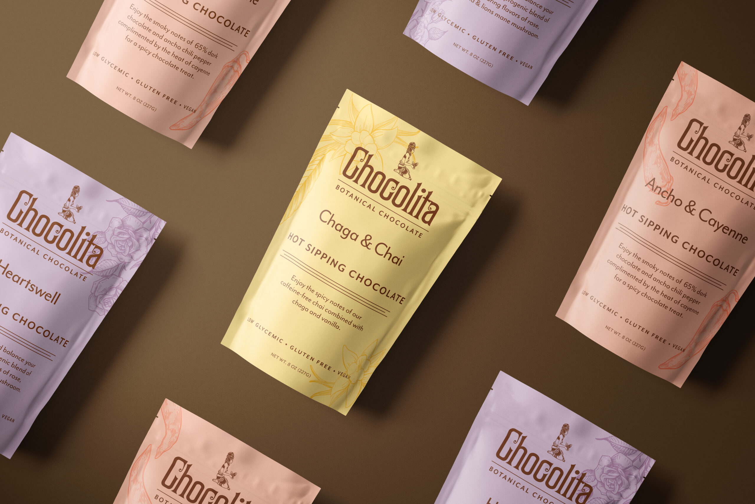
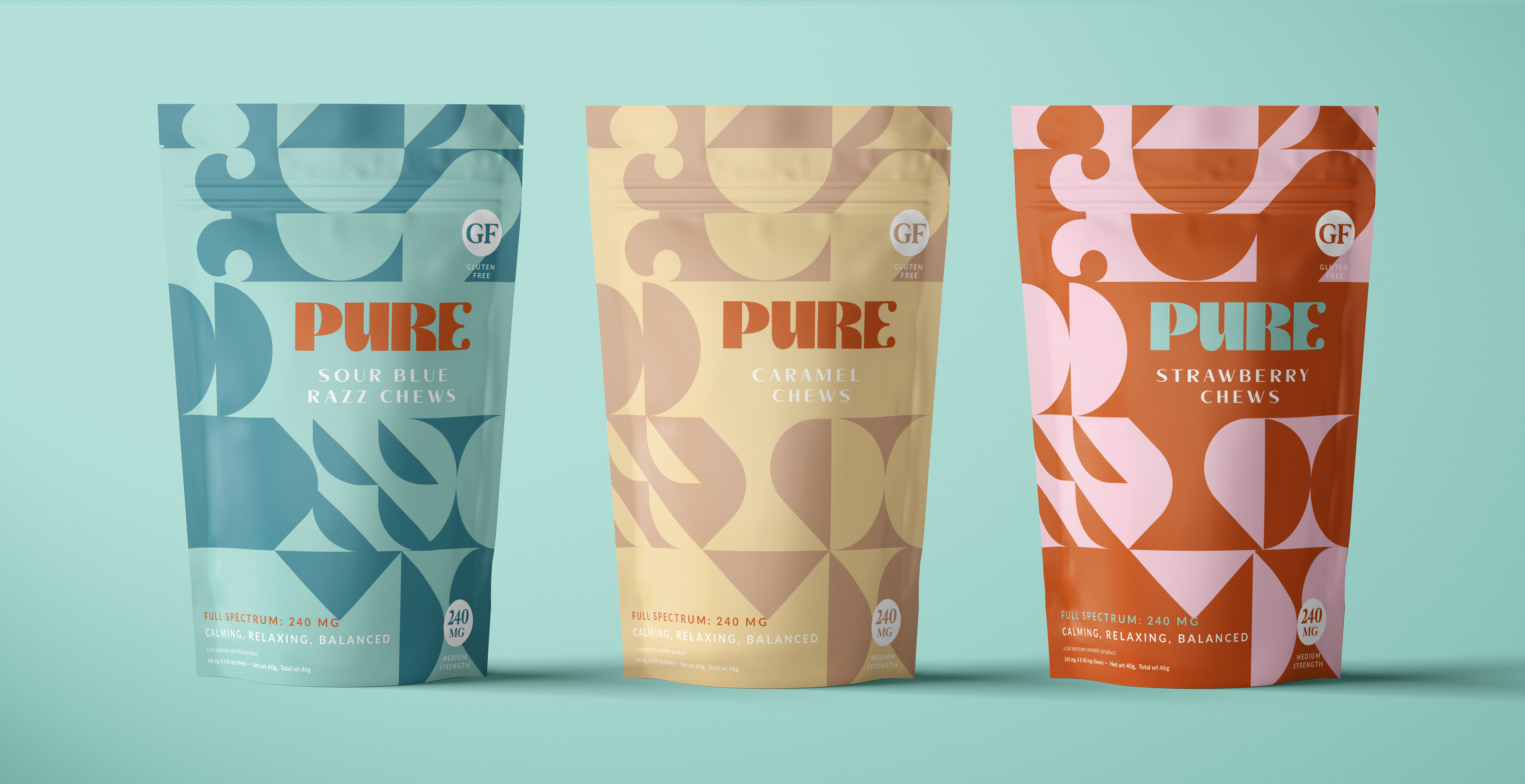
Headlines, typography on the front of packaging, typography on social media graphics, are all case 1. You want to draw the eye, make the reader stop and look, pick up the item (or click), look closer. You want to entice, stand out, create an emotional connection, build a link between your brand and the customer. In this context be creative! Have fun and experiment with color, scale, layout, etc. Keep your viewer or user in mind. What will resonate with them? In this example, we used a chunky custom font and bright colors and patterns to draw the eye, make an impact, and evoke a fun (high) feeling. Reading a whole paragraph in this font would be torture. But for a short, simple product name, it is perfect.
In case 2 you simply want to make the information as clear and readable as possible.

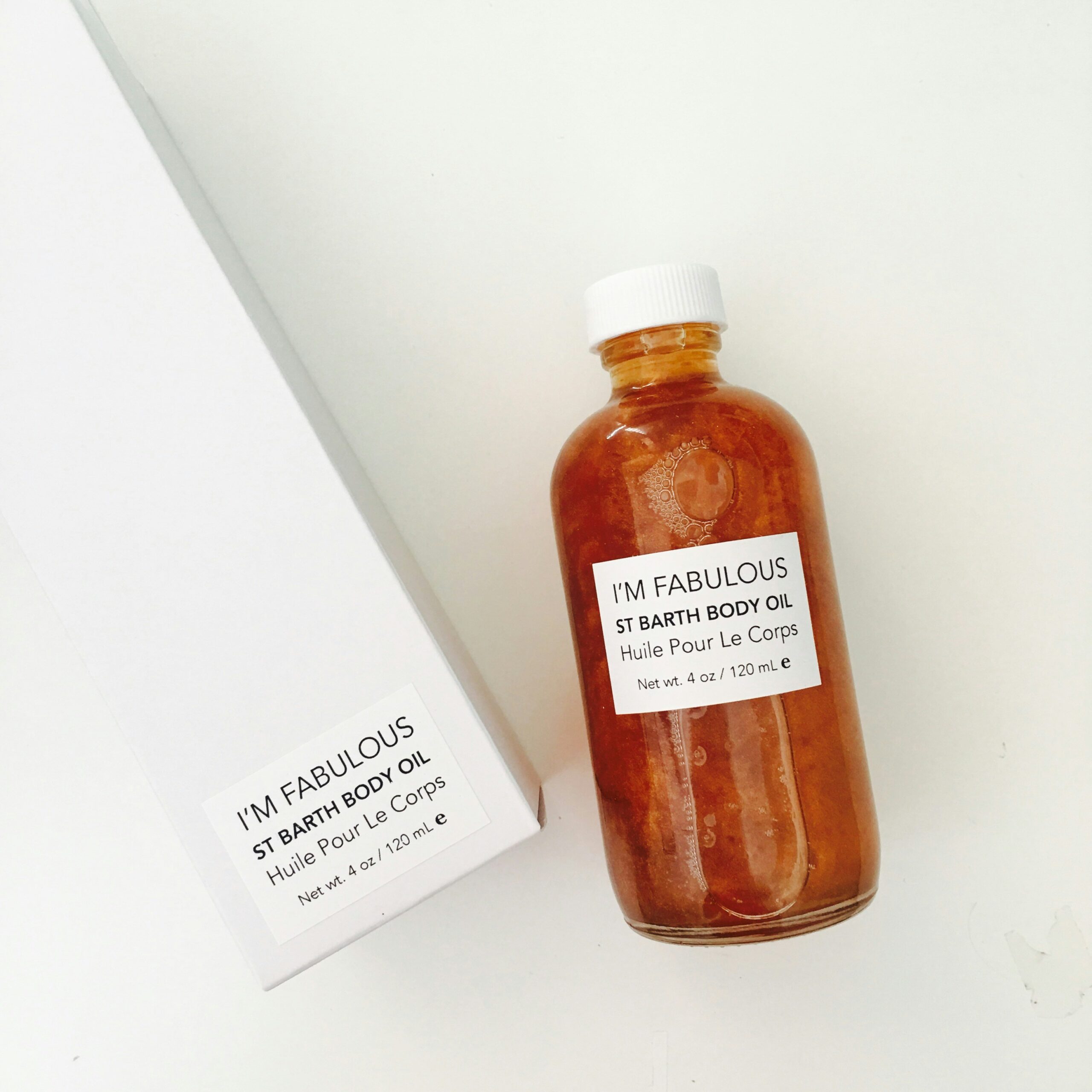
Books, magazines, ingredient lists, and body copy on websites are case 2. Now that the reader is engaged, they are reading to get information. They want to learn more, gain knowledge, and get through this information as quickly as possible. In this example, I had to present a lot of information, including regulatory info that had to be included, as cleanly and clearly as possible, while still maintaining consistency and adhering to the brand guidelines.
Once you have determined the proper context, you can make better typography and design decisions.
After determining the context, the next step is hierarchy. This is directing the reader what to read first, second, third, etc. More on that next post!

Comments +