When I was just a baby designer I remember thinking color was so confusing and a bit scary. What are all those letters? HSB, CMYK, RGB, HEX ??? And to make it worse screen color is made of light and pigments and ink on paper is a physical pigment. How can we possibly have consistent color? Answer: It’s very hard. First let’s define some terms…

BASIC DEFINITIONS:
hue: the actual color on the rainbow: red, yelllow, green, blue, etc.
value: the lightness or darkness of a color
saturation: the concentration of a color
PANTONE
Pantone is a company that produces color standards for design and production. You will sometimes hear them referred to as Pantone colors and sometimes as PMS colors (Pantone matching system). This is one way to have consistent color across mediums. Pantone 642C, in theory, is the same color whether it is printed on metal, paper, fabric, etc. Designers and printers have swatch books which give a physical anchor for each color. So instead of subjectively describing a color as light dusty teal (which can mean anything) you have a standard, and can tell the printer “Pantone 642C”. When you get a proof of your printed item back, you can pull out your handy swatch book to check the accuracy of the color. You can import Pantone libraries into Adobe software and Pantone’s pigment-based color is translated into a color on the screen. Even if you are not getting an item printed digitally, Pantones can provide a reference for your printer to match their output to.
Another note about Pantone, Pantone libraries come in C (coated), and U (uncoated). C was intended for coated paper and U for uncoated paper. If you are planning on doing a lot of printed materials, choose a C or a U color based on whether you will use more coated (glossy) paper or uncoated (matte) paper. If you don’t plan on doing a lot of printing, either will work, but make sure you are consistent.
There are also speciality Pantone swatch books for other industries. The Pantone Fashion and Home swatch books are meant primarily as a reference point for dyed and printed fabrics. There are also swatch books for plastics, metallics, and many other substances.
CMYK
Pigments for commercial printing are made up of Cyan, Magenta, Yellow, and Black. This is historically how offset printing is done, with small dots of C, M, Y, and K inks making up the full range of colors. Why is black K instead of B? I have no idea. Generally most printing today is done on digital presses, or offset presses for higher volume printing. Commercial printers generally still prefer files set up in CMYK color space. There are exceptions to this, depending on the printer, so please make sure you double check.
RGB
Colors on screens are made of light. The three colors of light that make up the spectrum are Red, Green, and Blue. For that reason when working digitally, you want to have your colorspace set up as RGB. There are different ways to notate RGB colors, such as HEX, HSB, HSL, which I will explain below. Of course, all screens are different! They all have different color profiles and brightness, so your RGB values will never be consistent across different types of screens, but you can have color consistency across all the media you control. The differences between screens are becoming especially noticeable since manufacturers are learning about the dangers of too much blue light and adjust screens to have a warm cast at night. Screens are also being made to adjust automatically to ambient light changes in the room.
HEX
Hex colors are a way to denote colors on screens through hexadecimal values. Most browsers recognize all hex colors as well as allow for transparency. Don’t worry about what each decimal point means, unless you love to geek out about color and math. Just know you can copy and paste hex colors easily from an application such as photoshop to a web design platform, for example, and color will remain consistent.
HSB (HSV)
HSB stands for hue-saturation-brightness, and is a more human-friendly way of describing color. So instead of hexidecimals, each number represents hue, saturation, and brightness, which are all things that we can imagine! Please remember, this is just an alternative method of describing the same color.
HSL
HSL stands for hue-saturation-lightness which is the cousin to HSB, with lightness standing in for brightness and is used to represent pigments rather than light.

OK SO HOW DO I GET CONSISTENT COLOR?
A FEW TIPS:
All screens are different so set the expectation from the beginning that color will look different on different screens and different environments.
1.) If color matching is critical, use Pantones and pick them from a physical Pantone book, not from the screen. Even if you don’t plan on using Pantone quality printing, Pantones provide a physical anchor for the color. From the Pantone color picked you can derive the CMYK and RGB colors using the Pantone color bridge swatch book. If you don’t have a color bridge swatch book, you can use the conversions built into Adobe software. For example click on the Pantone swatch, click on the color to bring up the color picker and you will be able to see the conversions. Beware this is not as accurate as the conversions in the Pantone color bridge swatch book.
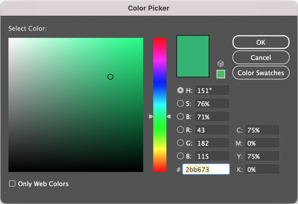
2.) What is color is not that critical? Obtaining physical Pantone chips can be costly and working with them can be time consuming, so if color is not critical, you can use CMYK color for printing, RGB color for screen, and use the HEX notation for RGB colors for web design. Step one would be to pick a color that looks good on your screen. Make sure your screen is not adjusting to ambient light or blocking blue light. Once you have the color picked you can use the conversions that are built into Adobe software to move from one method of notation to another. See the color picker in Adobe software above. You will find the corresponding RGB, CMYK, HEX codes for your color. Just keep in mind that with the inconsistencies in screens and pigments, it is harder to keep everything matching consistently. Just beware that if you send something off to be printed it may not match perfectly with items printed from other printers or manufacturers. You have to be ok with this uncertainty (It’s hard, I know!).
3.) What if my brand is in an all-digital environment? Lucky you!! You don’t have to worry about printing, so just pick a color that looks good on your screen. Make sure your screen is not adjusting to ambient light or blocking blue light. Then pull up the color picker to see all of the conversions. The easiest way to cut across mediums, for example photoshop to web, is to copy and paste the hex value. Just be aware that screens vary A LOT, especially in this era of self adjusting screens and blue light night shifts. So it’s a good idea to check the colors you picked on a few screens at different times and lighting situations and make sure that they still all work together.
I hope this helps! Please reach out to me with any questions.



Comments +